Synopsis
Title: 'Bare'
The main character is lonely and has nothing to do but his job, eat and sleep. His daily routine is going to the bar and slowly drinking beer and staring at spaces/day dreaming. Every time after he’s done with his job he goes straight into the bar and follows the same routine. Same stuff every day on and on. Like every other day in the bar he's sitting down, looking miserable. He starts playing around with his shoe. Trying to accomplish nothing. Suddenly the shoes manages to slip off and that moment when the sweet cold air breezed passed the soul of his feet, he felt alive, free. He started to be more active and outgoing. He noticed things he didn't notice before. He would do everything with bare feet even running. During one of his running session a girl comes up and starts talking the whole thing. It was love at first sight for him. From their they end up running together and slowly both of them starts to feel the same connection. The girl ends up buying him a new pair of shoes which he doesn't like the idea of wearing but does just for her. He feels trapped and the old miserable memories starts diving in. He throws the shoes and runs away from her. Nothing ends up happening for him from this point and realises that it was all because of her. He goes back to her trying to make it up to her. She also apologies to him for pushing him to wear the shoes. Both of them really missed each other and they could both could tell by looking at each other. They both smile and kiss.


Storyboard

Tutorial about after effects/ title sequence footage
Videos
Goodbye sober day
understand music
Steps for the video
new compostion
compostion retain layer sizes
hdtv 1080 25
comp1 select all the layer and click on the last box
layer- new-pre camera
press c for different functions four functions
1 view then 4 views
layer new light

Title Sequence
This is a way of presenting the movies titles, cast members in a very professional manner. Title sequence should be able to give the feel of the film even though it may just consist words. It may not be clear but it has to somehow relate to the film. The whole thing might not consist of any words and can be effective or the other way around.
Orange is the new black
This is the title sequence for the TV series ‘orange is the new black’. I feel like this title sequencing fits the tv series and you can get overview idea of what you can expect from it. I like how everything is focused on the face. Maybe they are trying to get us comfortable with the criminal by getting up and close with them. From up close we just know that they are normal person not some people who are in jail. All the faces that are presented in this video are of women and is backed up strongly with the singing of a woman. However there are few scenes in here that lets us know for sure that they are female convicts.
I liked the whole aesthetic of this title sequence, how it was crafted very accurately with different products such as ketchups and food. It was very unique how they were done manually and had that sense of childlike but yet professional feel. However its kind of hard to figure out what the actual TV series is going to be about even though there a lots of hand written writings.
Lord of the war
I like how at the start it slowly goes down and lets us get inside the machine. Also the song is fitted perfectly and has that same sense of story. It is showing the making of a bullet that gets sent for the war. The process is being shown to us, the journey of a bullet. The colour of the whole thing when the intro starts is kind of greenish maybe to represent money and how it is used to control everything. This single bullet is travelled through a lot of places. I like how it is showing the perspective from a bullets side. This very bullet ends up killing a african child. This narrative has a good starting point for us what to expect from the movie which is basically about guns, war and money.
Saul Bass ( Ocean's 11)
First thing I notice is the colours and how its the main attraction in this title sequence. This reminds me of casino light which are really bright and fun to look at. This is done perfectly. It functions like a real casino lights too. The colour stands out even more because of the black background. The transition from one number to another is executed flawlessly. The numbers are all coloured except for the names, they are done in white making it more visible than the numbers. But not taking too much away from other elements around it. At the later stages the numbers are replaced by beautiful designs which you would also normally find in Las vegas. The idea of the lottery machine is used in a clever way. Its done really cleverly how there are different section for the names instead of the normal lottery machine icons.
Drive
The sequence starts off with a song and an overview of a city during nighttime. The song and the night view of city blends in well. The first person we see is the leading protagonist in his car driving. The typeface is very cool and the colour of it stands out in the dark themed intro. The movie is called 'Drive' so basically the most of the intro is off the main guy driving around. Its simple and relates to the whole theme of the movie straight away.
Typography
The typography I normally find interesting are simple and fitting the style of the movie. For my movie I didn't want it to be flashy and catching too much attention as it might not benefit the video.

For the movie Drive's title sequence this very font is used. It fits the whole theme as the title sequence was filmed during night time so it stands out amongst its surrounding. Its flashy and kind of gives out that night life feel because of the font type and the colour especially.

This is from the movie Juno. As you can see the whole thing has drawn out images. Its really appealing to the eyes, the way the colours and the drawings workout so well together. Also the main thing to notice is the font as it is consistent with the whole video. Its placement and size are in perfect space and is coloured according to the background.

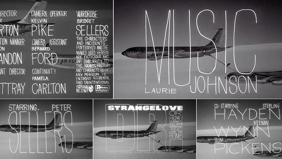
Dr. Strangelove
Right away the titles is the thing you notice first as it is white in a black background. Not only that but the size and the space its covering is very impacting. I really the love type choice. Its complimenting the whole black background perfectly. What I like about the type is that it is very thin but expanded to an enormous size. Thats what really appealed to me.

Dexter
First I notice is the colour red and how it is used throughout the sequence. This could mean that this series is going to be related to the blood. To support it they have pretty dangerous clips playing in the background so its pretty clear that it is either thriller or something related with crimes. The type is simple and powerful at the same time maybe its because of the colour. Colour is playing a vital role.
Inspirations
500 days of summer

I am interested in this type of look. Not too bright nor too dark but slightly darker than the normal. For me this balance of colours are perfect.

In some scenes the whole mood is changed and the visuals back it up to support it as this can be seen above. Its a lot more darker than before. But not dark enough to consume the feel, right amount of sadness is applied.

Here in its happy moments the colours look brighter and sunnier. The whole thing just looks really happy and can be sensed just by looking at it. The leaves are bright green, theres right amount of sunshine and this is working well with the people happy faces.
I want this same vision applied to my title sequence.
Ideas for the main title sequence
title sequence will have to do with feet,
film of feet walking, running, resting it can be with shoes or just naked feet.
it can include animals running wild, sense of freedom when they are running without worries
camera angles will include pov, sideways, may include the camera shaking to give it that same effect


These are some images of what the title sequences will work towards. Just the presence of feet in the sequence nothing else. The colours will be manipulated with and will be changed into a bit denser feel. The images above are too bright and has that feel good vibe which I don't want to give out in my title sequence.
Evaluation
At the beginning I wasn't sure of and completely unaware of the title sequences. I didn't know they played such a major role in film making. I was really interested in learning how this field of work was so important. I got to see some very good examples of title sequences and gave me lots of idea on how it can be used. At the start we were given to research about it. I got to know learn more about it. We also had a tutorial about the title sequence. For it we used after effects which I've used before but wasn't fully comfortable with it. We learned things related to the title sequence but it was based more on 2d based look. This wasn't very helpful for me because I had another idea for my video.
For my video the whole thing was going to be based on feet. This is because of my synopsis as it was based on something that happened with the protagonist. Other parts of the human body is not going not be included. I needed a lot of filmed clips of someone walking and running. For this, my friend was able to help me. I also put myself on the video. While filming I was looking around different spots, not usual space. I wanted have space that was unique and had a good look. After finding a spot I had to decide what types of shot would this be much effective with. I took a lot of experiment and stuck to the ones that appealed to me. It was kind of difficult task to find a good spot and also the weather had to be sunny. I filmed around 3-4 pm just when the sun is about to set. This would give out a perfect atmosphere that I had imagined for my sequence. Not too bright or too dark. I would use the footage in after effects and edit it there. My skills were pretty limited so I had to stick to the simple things. The type had to compliment the visuals. This I didn't manage to find due to the limitations of the computer. But I worked with whatever was around the aftereffects and tried to fit it in.
This was the only thing I struggled with, other than that I enjoyed the whole process of filming and editing it. The steps of slowly being able to see your ideas coming alive is a good thing to feel. I enjoyed this module and learned a lot from it.
Lord of the war
I like how at the start it slowly goes down and lets us get inside the machine. Also the song is fitted perfectly and has that same sense of story. It is showing the making of a bullet that gets sent for the war. The process is being shown to us, the journey of a bullet. The colour of the whole thing when the intro starts is kind of greenish maybe to represent money and how it is used to control everything. This single bullet is travelled through a lot of places. I like how it is showing the perspective from a bullets side. This very bullet ends up killing a african child. This narrative has a good starting point for us what to expect from the movie which is basically about guns, war and money.
Saul Bass ( Ocean's 11)
First thing I notice is the colours and how its the main attraction in this title sequence. This reminds me of casino light which are really bright and fun to look at. This is done perfectly. It functions like a real casino lights too. The colour stands out even more because of the black background. The transition from one number to another is executed flawlessly. The numbers are all coloured except for the names, they are done in white making it more visible than the numbers. But not taking too much away from other elements around it. At the later stages the numbers are replaced by beautiful designs which you would also normally find in Las vegas. The idea of the lottery machine is used in a clever way. Its done really cleverly how there are different section for the names instead of the normal lottery machine icons.
Drive
The sequence starts off with a song and an overview of a city during nighttime. The song and the night view of city blends in well. The first person we see is the leading protagonist in his car driving. The typeface is very cool and the colour of it stands out in the dark themed intro. The movie is called 'Drive' so basically the most of the intro is off the main guy driving around. Its simple and relates to the whole theme of the movie straight away.
Typography
The typography I normally find interesting are simple and fitting the style of the movie. For my movie I didn't want it to be flashy and catching too much attention as it might not benefit the video.

For the movie Drive's title sequence this very font is used. It fits the whole theme as the title sequence was filmed during night time so it stands out amongst its surrounding. Its flashy and kind of gives out that night life feel because of the font type and the colour especially.
This is from the movie Juno. As you can see the whole thing has drawn out images. Its really appealing to the eyes, the way the colours and the drawings workout so well together. Also the main thing to notice is the font as it is consistent with the whole video. Its placement and size are in perfect space and is coloured according to the background.
Dr. Strangelove
Right away the titles is the thing you notice first as it is white in a black background. Not only that but the size and the space its covering is very impacting. I really the love type choice. Its complimenting the whole black background perfectly. What I like about the type is that it is very thin but expanded to an enormous size. Thats what really appealed to me.
Dexter
First I notice is the colour red and how it is used throughout the sequence. This could mean that this series is going to be related to the blood. To support it they have pretty dangerous clips playing in the background so its pretty clear that it is either thriller or something related with crimes. The type is simple and powerful at the same time maybe its because of the colour. Colour is playing a vital role.
Inspirations
500 days of summer
I am interested in this type of look. Not too bright nor too dark but slightly darker than the normal. For me this balance of colours are perfect.

Here in its happy moments the colours look brighter and sunnier. The whole thing just looks really happy and can be sensed just by looking at it. The leaves are bright green, theres right amount of sunshine and this is working well with the people happy faces.
I want this same vision applied to my title sequence.
Ideas for the main title sequence
title sequence will have to do with feet,
film of feet walking, running, resting it can be with shoes or just naked feet.
it can include animals running wild, sense of freedom when they are running without worries
camera angles will include pov, sideways, may include the camera shaking to give it that same effect
These are some images of what the title sequences will work towards. Just the presence of feet in the sequence nothing else. The colours will be manipulated with and will be changed into a bit denser feel. The images above are too bright and has that feel good vibe which I don't want to give out in my title sequence.
Evaluation
At the beginning I wasn't sure of and completely unaware of the title sequences. I didn't know they played such a major role in film making. I was really interested in learning how this field of work was so important. I got to see some very good examples of title sequences and gave me lots of idea on how it can be used. At the start we were given to research about it. I got to know learn more about it. We also had a tutorial about the title sequence. For it we used after effects which I've used before but wasn't fully comfortable with it. We learned things related to the title sequence but it was based more on 2d based look. This wasn't very helpful for me because I had another idea for my video.
For my video the whole thing was going to be based on feet. This is because of my synopsis as it was based on something that happened with the protagonist. Other parts of the human body is not going not be included. I needed a lot of filmed clips of someone walking and running. For this, my friend was able to help me. I also put myself on the video. While filming I was looking around different spots, not usual space. I wanted have space that was unique and had a good look. After finding a spot I had to decide what types of shot would this be much effective with. I took a lot of experiment and stuck to the ones that appealed to me. It was kind of difficult task to find a good spot and also the weather had to be sunny. I filmed around 3-4 pm just when the sun is about to set. This would give out a perfect atmosphere that I had imagined for my sequence. Not too bright or too dark. I would use the footage in after effects and edit it there. My skills were pretty limited so I had to stick to the simple things. The type had to compliment the visuals. This I didn't manage to find due to the limitations of the computer. But I worked with whatever was around the aftereffects and tried to fit it in.
This was the only thing I struggled with, other than that I enjoyed the whole process of filming and editing it. The steps of slowly being able to see your ideas coming alive is a good thing to feel. I enjoyed this module and learned a lot from it.
No comments:
Post a Comment